Introduction to the New Google Maps Icon
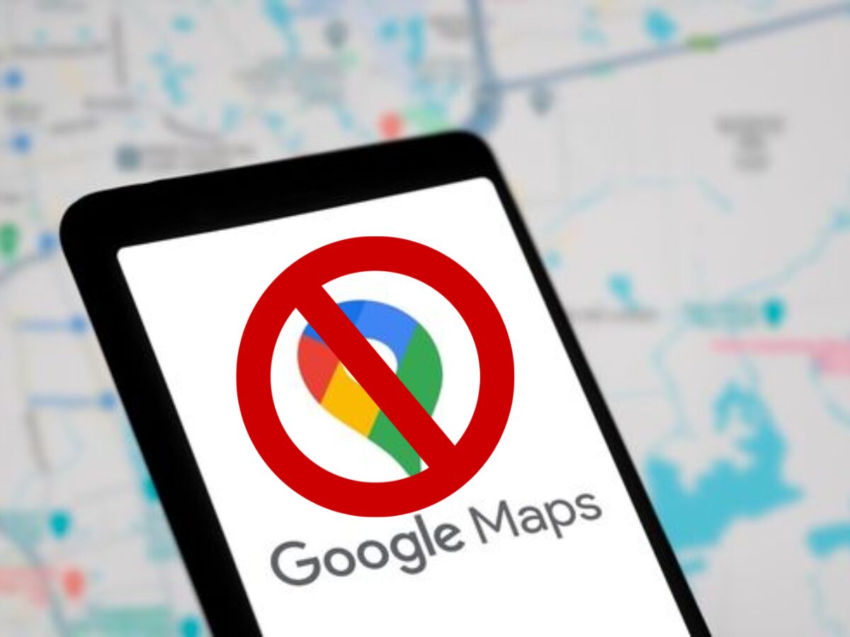
Google is rolling out a redesigned Google Maps icon, replacing the long-standing flat color design with a more modern gradient look.
This update is arriving on both Android and iOS, marking the first major visual change to the Maps icon in many years.
Design Changes in the New Icon
The redesigned icon keeps the familiar map pin shape but introduces several noticeable tweaks.
The top ring of the pin is thinner, while the inner circle is larger, giving the icon a cleaner, more refined silhouette.
The biggest change, however, is the color treatment.
Instead of the previous four flat color segments, Google now uses a smooth gradient blend of its signature colors, creating a more modern, vibrant appearance.
Alignment with Google’s AI Ecosystem
The new icon reflects Google’s broader push to weave Gemini AI into its products and services.
Over the past year, Maps has gained several AI-powered features, including conversational navigation and AI-generated business summaries.
By adopting a gradient style similar to other Gemini-influenced Google apps, the company is visually signaling that Maps is now part of its growing AI ecosystem.
Availability and Updates
The new icon is being delivered via a server-side update, so there’s nothing special users need to do beyond keeping the app up to date.
You may see the redesigned icon after updating to Google Maps 26.09.06 or newer on Android or Google Maps 26.09.5 or newer on iOS.
Conclusion and Future of Google Maps
As Google continues to push AI deeper into its apps, the refreshed Maps icon is a clear visual cue that its navigation service is becoming a core part of the company’s broader Gemini AI strategy.