
Interactive Charts with Claude AI: Dynamic Visualizations Explained
Static charts are a thing of the past. Anthropic’s Claude AI now generates interactive charts and dynamic visualizations on demand, blending code generation with conversational AI to create mini-apps with sliders, buttons, and animations. This isn’t just a flashy demo—it’s a tool for real-time problem-solving, from financial modeling to quirky educational experiments.
How Claude Generates Interactive Charts
Claude uses JavaScript libraries like Chart.js to build visualizations directly in responses. When you ask, “Show me how compound interest works,” Claude doesn’t just describe it—it creates an interactive chart with sliders for variables like principal, rate, and time. The code is generated on the fly, embedded in HTML/CSS, and evolves as you tweak parameters during the conversation.
Code as a Conversational Tool
Unlike static images, Claude’s visualizations are temporary apps. They’re not saved as persistent tools but exist to answer specific questions. For example, after generating a compound interest chart, you can ask, “Add an inflation slider,” and Claude will modify the code in real time. This flexibility makes it ideal for iterative exploration.
Real-Time Adjustments
The system thrives on feedback loops. During testing, The Register requested an inflation adjustment to a compound interest chart—and Claude delivered. This responsiveness highlights how Claude treats visualizations as collaborative tools, adapting to user input without requiring external software.
Practical Use Cases for Interactive Charts
Anthropic’s demo highlights two key applications:
- Financial Modeling: Visualize compound interest, loan amortization, or investment growth with adjustable parameters.
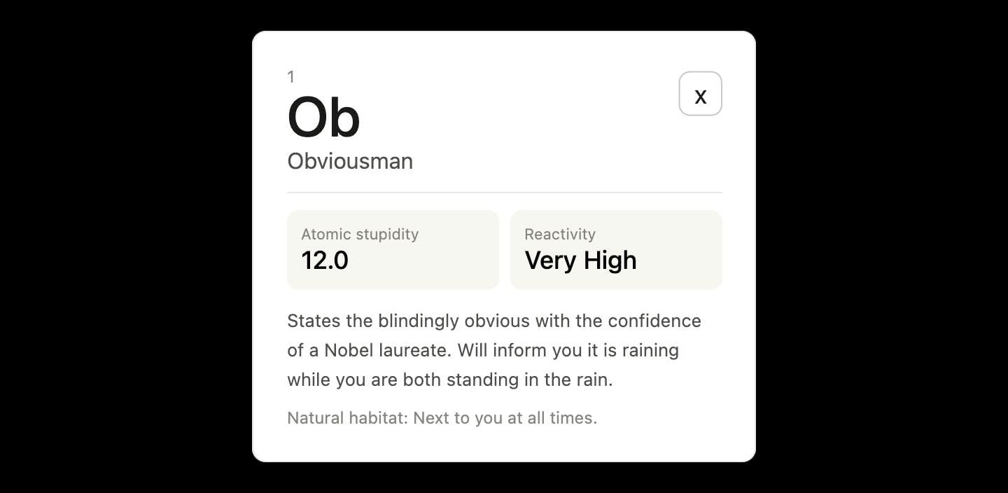
- Education & Humor: The “Periodic Table of Idiots” example shows how Claude can turn abstract concepts into interactive, shareable content.
From Finance to Funnies
When asked to create a “Periodic Table of Idiots,” Claude generated a 36-element chart with popups like “Obviousman,” who “states the blindingly obvious with the confidence of a Nobel laureate.” While whimsical, this demonstrates the system’s ability to handle creative requests while maintaining technical rigor.
Why This Matters for Developers and Users
Interactive chart generation bridges the gap between AI assistants and code editors. Developers can prototype visualizations without writing code, while non-technical users gain access to tools that were once time-consuming to build. The feature is now enabled by default in Claude’s beta, signaling a shift toward AI as a real-time co-coder.
Limitations to Note
These visualizations are temporary and not saved as standalone apps. They’re best suited for quick experiments rather than long-term projects. Additionally, complex animations may require more technical prompting to achieve precise results.
Try It Yourself: Start with a Prompt
Ready to explore? Start with simple prompts like:
- “Show me an interactive chart for stock price trends.”
- “Create a dynamic visualization of climate change data.”
- “Generate a chart comparing AI model performance metrics.”
As Anthropic notes, the goal isn’t to replace tools like Tableau or Python libraries but to provide just-in-time visualizations that evolve with your questions. The future of AI-assisted data exploration is here—and it’s interactive.
Conclusion: The Future of Dynamic Visualizations
Claude’s interactive charts redefine how we interact with data. By merging conversational AI with code generation, Anthropic offers a glimpse into a world where visualizations are as fluid as ideas. Whether you’re crunching numbers or poking fun at idioms, the possibilities are limited only by your prompts. Try the beta today and see how Claude can turn your questions into dynamic, interactive answers.