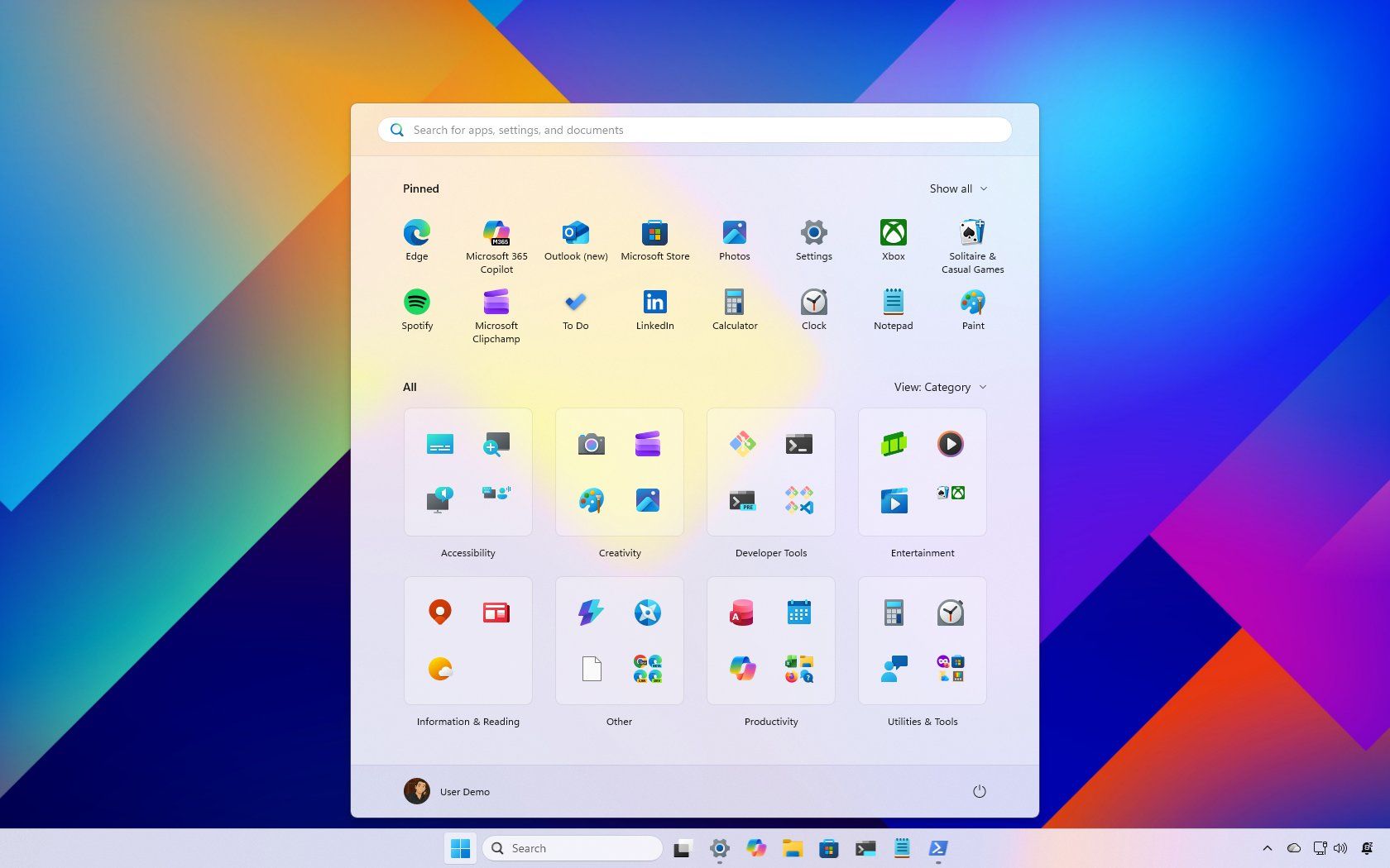
Windows 11 Start Menu Redesign: Community Reactions & Fixes
Microsoft’s latest overhaul of the Windows 11 Start menu has sparked a firestorm of mixed reactions. While some users praise the streamlined integration of pinned apps and the ability to disable the “Recommended” section, the majority of feedback centers on one core issue: Windows 11 Start menu feels bloated, overly automated, and lacking in customization. Let’s break down the key complaints and solutions.
The Size Issue: Why Users Call It ‘Too Big’
On large desktop monitors, the new Start menu is described as a “colossal waste of space” and “basically a start screen again.” The oversized tiles, excessive padding, and lack of density controls make it feel closer to Windows 8’s full-screen experience than the compact, efficient menu of Windows 10. Laptop users, however, are more forgiving, highlighting the contrast between touch-optimized designs and desktop-centric efficiency.
Automatic Categorization: A Feature Without Control
Microsoft’s headline feature—automated app grouping—has backfired for many. Apps like Steam and Xbox are scattered across multiple categories, while Microsoft 365 tools end up in the catch-all “Others” folder. Users report no ability to rename, delete, or manually reassign these groups. As one Reddit user put it: “The concept is fine, but the lack of customization makes it useless.”
Third-Party Tools to the Rescue
When Microsoft fails to deliver customization, users turn to third-party solutions. Tools like Windhawk, Start11, and Open Shell allow users to resize the menu, adjust spacing, and restore classic layouts. These apps are not just workarounds—they’re a testament to growing frustration with Microsoft’s one-size-fits-all approach.
The Nostalgia Factor and User Fatigue
Many users long for the simplicity of Windows 7 or 10’s Start menus. The constant interface changes, paired with no easy way to revert, have led to calls for a “visual profile system” that lets users toggle between design styles. As one commenter noted: “I’m so close to switching OSes because of these enforced UI changes.”
Performance Bugs and Design Flaws
Functional issues like flickering icons, laggy animations, and missing app renderings have further eroded trust in the redesign. For high-end users with top-tier hardware, these glitches feel inexcusable. The menu’s performance problems underscore a broader concern: Microsoft prioritizes aesthetics over reliability.
How to Fix the Windows 11 Start Menu
- Resize the menu: Use third-party tools to adjust spacing and tile size.
- Disable auto-categorization: Switch to “List” view for a more traditional layout.
- Customize with Windhawk: Remove the “Recommended” section and tweak app groupings.
- Revert to classic styles: Use Open Shell to restore Windows 7/10 aesthetics.
Final Thoughts: A Missed Opportunity
The Windows 11 Start menu redesign has potential but falls short in execution. Users want control—not automation. If Microsoft adds category editing, density controls, and performance fixes, the conversation could shift. Until then, third-party tools remain the only viable solution for power users.
FAQs
1. Why is the Windows 11 Start menu so big?
The oversized layout and spacing are designed for touchscreens but alienate desktop users who prioritize efficiency.
2. Can I customize the Start menu categories?
Not natively. Third-party tools like Start11 allow manual grouping and resizing.
3. How do I disable the ‘Recommended’ section?
Right-click the Start menu, select “Settings,” and toggle off the “Recommended” option.
4. What’s the best alternative to the Windows 11 Start menu?
Windhawk and Open Shell offer the most flexibility for customization.
5. Will Microsoft fix the Start menu issues?
Future updates may address performance and customization, but current feedback suggests slow progress.